Optimize a portfolio, then test what the curve promises
A backtest above the CAC 40 is not enough: costs, stability, sensitivity and uncertainty change the decision.
Reconstructed organization. Frozen public prices; calculations and results genuinely executed and reproducible.
Frozen public dataReading plan
From problem to decision
- 01
Understand the mandate
Twelve French equities, one benchmark and one monthly decision.
- 02
Replay the initial approach
No future data and a cost attached to every change.
- 03
Build a more stable rule
Capped weights, shrinkage and a turnover penalty.
- 04
Decide with uncertainty
Compare metrics, scenarios and the active-return interval.
01
Before we begin
The problem
A reconstructed organization is considering a portfolio of twelve large French equities, with no short selling, and wants to compare it with the CAC 40.
The problem is not to find the prettiest curve after the fact. The decision is whether an allocation rule could have been used month after month with only the information available at the time.
Portfolio optimisation selects the share of capital allocated to each stock. It does not directly predict the next price: it seeks a compromise between estimated return, risk, concentration and the cost of changing positions.
02
Phase 1
What the organization built
We begin by understanding the system as presented, without caricaturing it and before proposing any correction.
The model's mandate
The reconstructed organization wants to allocate capital across twelve large French equities, without short selling. The CAC 40 is the benchmark: the aim is not to replicate it, but to test whether the model adds anything once risk is considered.
Each month, the prototype looks at the previous 252 trading sessions—roughly one market year—then estimates each stock's average return and how their movements relate to one another.
Why the first result looks convincing
The model may place up to 35% of the capital in one stock. This freedom strongly exploits the most favourable estimates and produces an attractive curve.
But the initial presentation charges neither repeated trading nor sector concentration. A small estimation error can therefore trigger a large portfolio change the following month.
Initial approach summary
- Means and covariance estimated over the latest 252 sessions.
- 35% position cap, with no sector control.
- Costs and turnover absent from the initial presentation.
03
Phase 2
What the assessment checks and proposes
The second phase reproduces the mechanism, locates what breaks and turns criticism into a testable change.
Replay without knowing the future
The test moves forward in time. At each date, weights are computed using only past data, applied to the following month, then charged 12 basis points per unit of capital traded. This is a walk-forward test.
The resulting 92 monthly decisions form an out-of-sample experiment: the model cannot go back and choose parameters that would have improved a difficult month.
Stabilise before seeking performance
The corrected rule reduces the influence of extreme estimates, caps each stock at 20%, limits each sector to 40% and penalises unnecessary changes. In other words, it gives up part of the theoretical return to obtain more usable behaviour.
Finally, 4,000 block resamples test the fragility of the additional return versus the CAC 40. The resulting interval crosses zero: the model may have done better, but the data do not establish that the advantage is real.
Assessment
- The 92 monthly decisions are replayed in order, without future information, and charged 12 basis points per unit of capital traded.
- The robust model annualizes at 10.15% versus 8.30% for the CAC 40, with 17.08% volatility.
- But block resampling gives a 95% interval of −3.70% to +6.80% for the return gap versus the index: this interval crosses zero.
Proposed correction
- Pull extreme return and dependence estimates towards more conservative values.
- Cap each position at 20% and each sector at 40%.
- Penalise portfolio changes and ignore small adjustments.
- Test 25 cost and stabilisation-strength combinations.
04
Concepts and equations
No symbol without a definition
The same notes open from the “?” links placed throughout the article.
05
Numerical results
What the numbers actually measure
The following metrics must be read together: return, risk, depth of losses and stability tell different stories.
robust annual return
Compound annual growth of the corrected approach.
annualized volatility
Annualised amplitude of daily fluctuations.
Sharpe ratio, zero rate
Return obtained per unit of total fluctuation.
95% active-return interval
The interval contains zero: the advantage is not established.
Comparative performance table
Out-of-sample period: 28 December 2018 to 31 July 2026, or 1,944 sessions. Returns use prices excluding dividends; the risk-free rate is set to zero. CAGR is the compound annual growth rate.
| Metric | Initial approach after costs | Robust approach after costs | CAC 40 price index | How to read |
|---|---|---|---|---|
| Total return | 104,75 % | 110,74 % | 85,05 % | Growth over the full period, without annualisation. |
| CAGR | 9,73 % | 10,15 % | 8,30 % | Compound annual rate linking starting and ending value. |
| Annualised volatility | 20,59 % | 17,08 % | 18,72 % | Typical fluctuation amplitude; lower does not mean loss-free. |
| Sharpe ratio | 0,555 | 0,652 | 0,520 | Return relative to all fluctuations, with zero risk-free rate. |
| Sortino ratio | 0,757 | 0,896 | 0,716 | Return relative only to downside fluctuations. |
| Maximum drawdown | −30,56 % | −31,31 % | −38,56 % | Worst fall from a peak to a subsequent trough. |
| Calmar ratio | 0,319 | 0,324 | 0,215 | CAGR divided by the absolute maximum drawdown. |
| Annual one-way turnover | 324,07 % | 33,94 % | N/D | Cumulative share of the portfolio traded in one year; the correction sharply reduces trading. |
06 · See the evidence
Read the charts step by step
Each figure first explains how to read its axes and colours, then what it does—or does not—support.
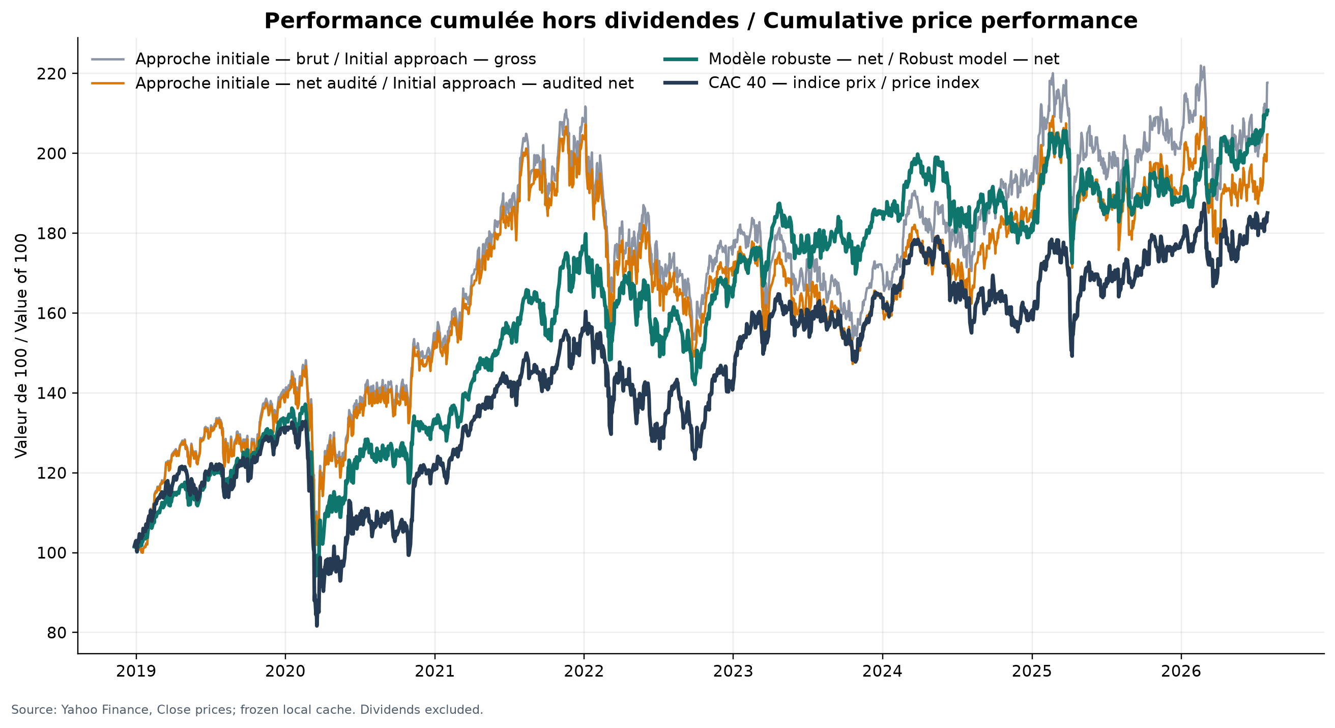
Cumulative performance of the models and CAC 40
The figure has one panel. The horizontal axis is date, from late 2018 to July 2026; the vertical axis is a unitless index, with every series reset to 100 at inception. Grey is the initial approach before costs, orange is the same approach after audited costs, dark teal is the robust approach after costs, and navy is the CAC 40 excluding dividends. To read a point, select a date and inspect the line's height: 180 means that an initial 100 has become 180, a cumulative gain of 80%.
At the end of the period, the net initial approach is about 204.75, the robust approach 210.74 and the CAC 40 185.05, corresponding to cumulative returns of 104.75%, 110.74% and 85.05%. We can conclude that, in this specific replay and after modelled costs, the robust line finishes highest among the three comparable net series. We cannot conclude that future or statistically established outperformance exists: dividends are excluded, the stock universe is fixed with hindsight, and one cumulative path does not show uncertainty around the difference.
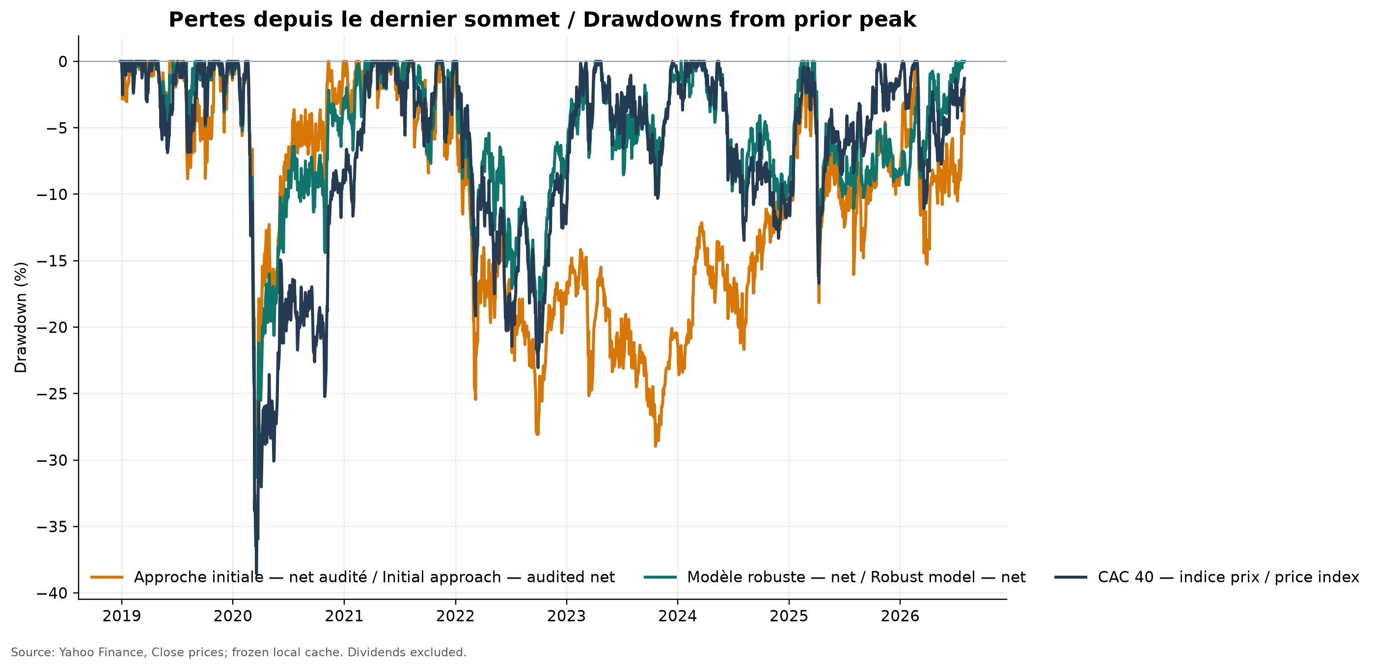
Drawdowns for the approaches and CAC 40
The figure has one panel. The horizontal axis is date; the vertical axis measures, in percent, the gap between current value and each series' own previous peak. Orange is the net initial approach, dark teal the net robust approach and navy the CAC 40 excluding dividends. A point at 0% means a new high; a point at −20% means the series is 20% below its previous high. It is therefore neither that day's return nor a loss relative to starting capital.
Maximum drawdowns over the full period are −30.56% for the initial approach, −31.31% for the robust approach and −38.56% for the CAC 40. We can conclude that the robust correction does not improve the worst trough versus the initial approach, even though it reduces other fluctuation measures; its trough is nevertheless shallower than the index in this test. We cannot conclude that a future decline will have the same depth or duration, or that the three troughs occur under identical economic exposures.
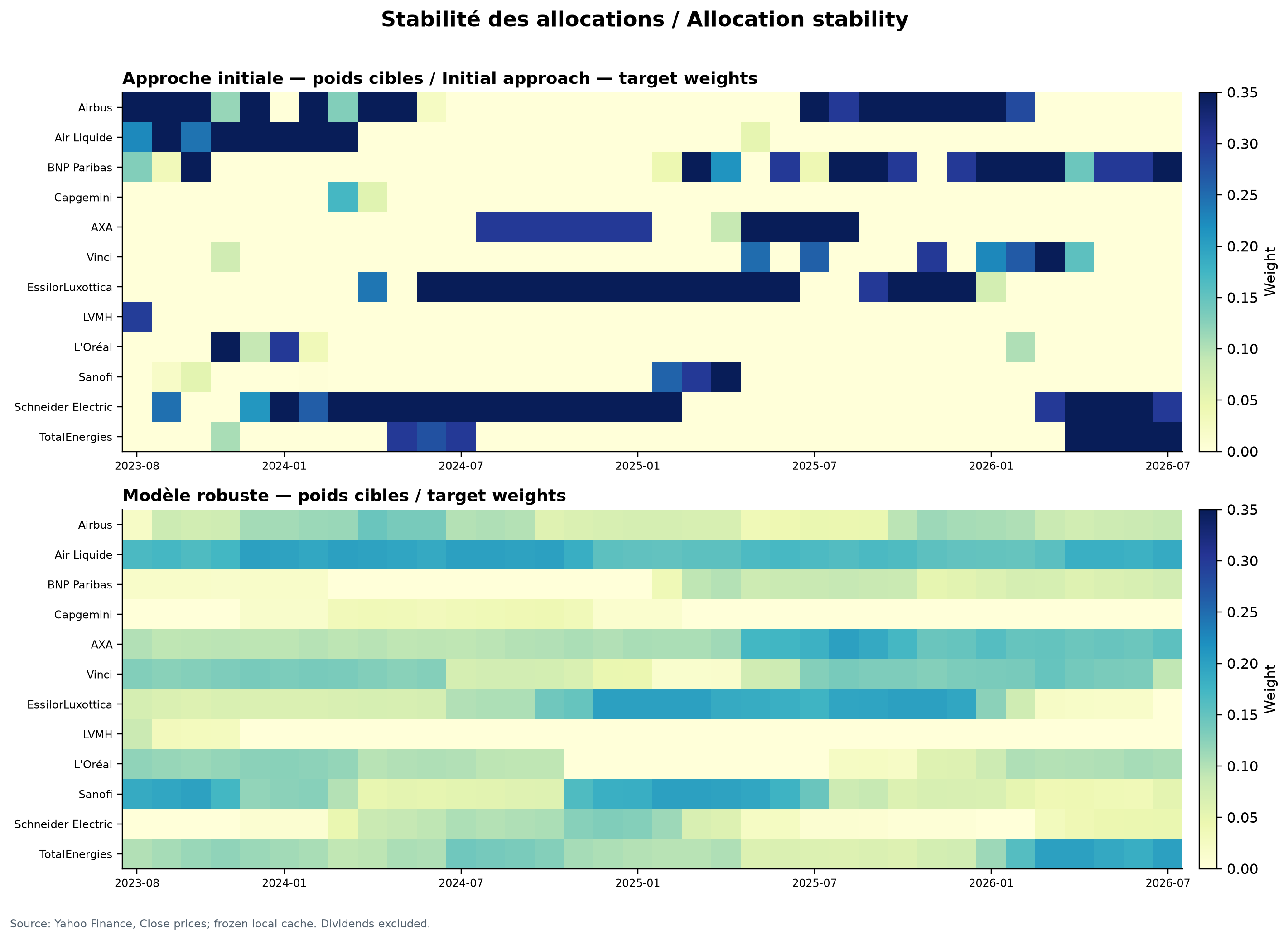
Heatmaps of monthly allocations
The upper panel shows target weights for the initial approach and the lower panel those for the robust approach. In both, the horizontal axis is monthly rebalancing date from August 2023 to July 2026 and the vertical axis lists the twelve stocks. Each cell is the fraction of capital allocated to one stock at one date: pale yellow is near 0 and dark blue reaches 0.35, or 35%. To read a cell, cross a company row with a date column and translate its colour using the scale to the panel's right.
The initial panel alternates many zero cells with blocks near the 35% limit, whereas the robust panel spreads capital across more names with more gradual transitions. We can conclude that regularisation makes target weights less concentrated and less discontinuous in this window. We cannot conclude that all positions were executed at those weights, that they would have been liquid, or that a smoother appearance alone produces better returns.
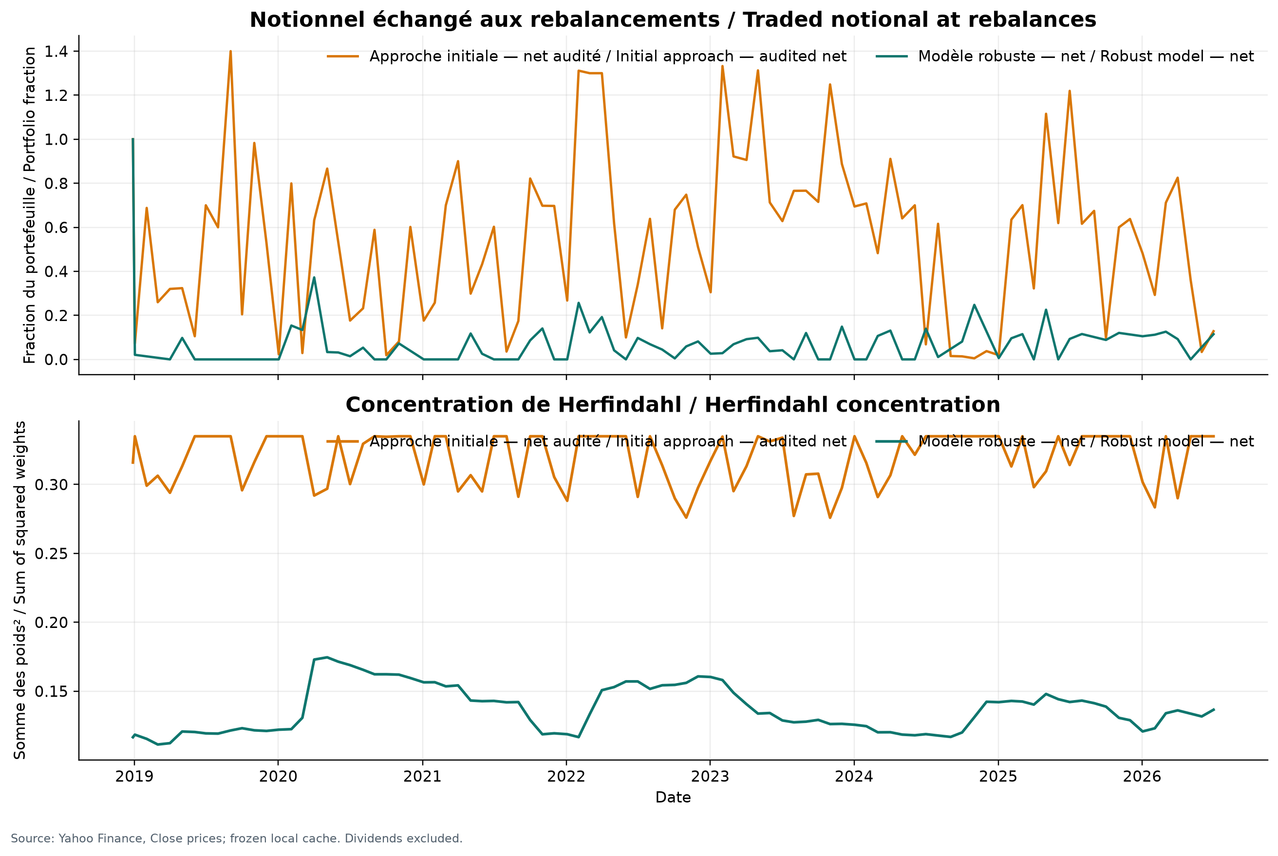
Portfolio turnover and concentration
Both panels share the same horizontal axis, rebalancing date from 2019 to 2026. In the upper panel, the vertical axis is gross notional traded divided by portfolio value: 1.0 means purchases and sales totalling 100% of the portfolio, and the measure can exceed 1. Orange is the initial approach and dark teal the robust approach; each peak is one rebalance. In the lower panel, the vertical axis is the unitless Herfindahl index, the sum of squared weights: about 0.083 for twelve equal positions and 1 for a single position. Each point therefore indicates concentration on that date.
Annualised gross notional falls from 6.61 for the initial approach to 0.81 for the robust approach; using the table's one-way convention and excluding initial funding, annual turnover is 324.07% versus 33.94%. Orange concentration usually lies around 0.28–0.34, versus roughly 0.11–0.17 in dark teal. We can conclude that the correction sharply reduces trading and concentration in the replay. We cannot equate these fractions with real cost: market impact, liquidity, tax and execution are absent, and the two turnover conventions must not be mixed.
Sensitivity to costs and shrinkage
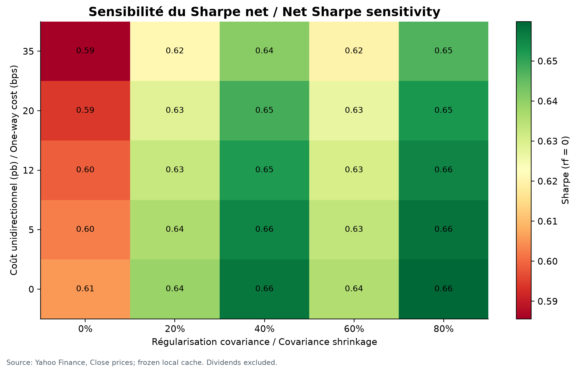
The figure has one panel formed by a 25-cell grid. The horizontal axis is covariance-shrinkage strength from 0% to 80%; the vertical axis is assumed one-way cost from 0 to 35 basis points per unit of capital traded. Each cell gives a unitless net Sharpe ratio computed with a zero risk-free rate; the printed number is the exact value, red denotes lower values and green higher values. A cell is therefore neither a date nor a security, but one assumption scenario.
The ratio ranges from 0.59 with no shrinkage and high costs to 0.66 in several cells with 40% or 80% shrinkage and low-to-moderate costs. We can conclude that shrinkage improves the result on this grid and that the advantage does not disappear under the tested costs, although it narrows. We cannot select the greenest cell after the fact as proof of an optimal setting, nor infer statistical significance or future performance from 0.66: the grid reuses the same history.
Rolling risk and active return
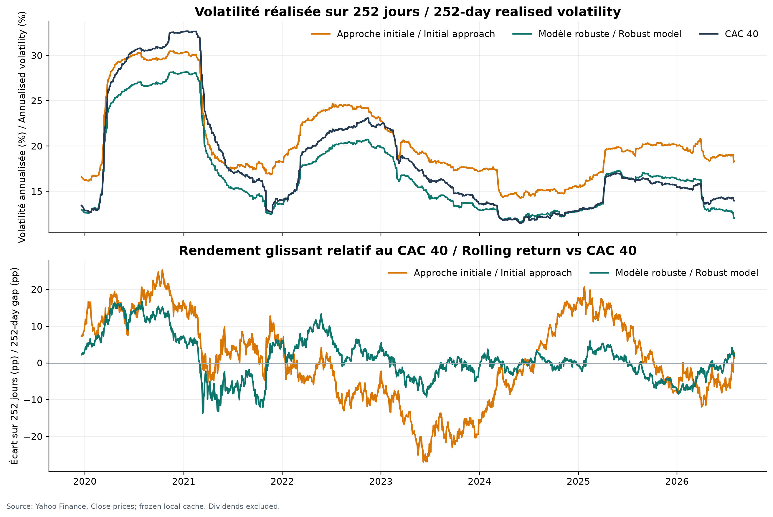
Both panels share the horizontal date axis from 2020 to 2026. In the upper panel, the vertical axis is annualised realised volatility in percent, computed at each date over the previous 252 sessions: orange for the initial approach, dark teal for the robust approach and navy for the CAC 40. A point's height therefore summarises the fluctuation amplitude over the preceding trading year. In the lower panel, the vertical axis is the percentage-point difference between the portfolio's 252-session compound return and the CAC 40's; orange or dark teal above zero means outperformance over that window, and below zero means underperformance.
The upper panel often shows lower robust volatility: around the 2020 peak it is close to 28%, versus about 30% for the initial approach and more than 32% for the index. The lower panel changes sign several times; the initial gap ranges roughly from +25 to −27 points and the robust gap from about +15 to −13 points. We can conclude that the correction dampens fluctuations in this replay, but relative advantage is not stable over time. We cannot count each date as a new independent piece of evidence because neighbouring windows share almost all observations, nor read these lines as a confidence interval.
07 · Assessment protocol
How the assessment was conducted
Assessment protocol
- Twelve French equities and the CAC 40 price index, 2 January 2018 to 31 July 2026.
- A 252-session window and monthly rebalancing tested chronologically.
- One-way cost: 12 basis points.
- Circular resampling: 4,000 simulations in 21-session blocks.
Limitations that matter
- The fixed universe was selected after the period: companies that disappeared or left the index are not restored.
- Closing prices and a price-only index, with dividends excluded.
- Yahoo Finance is not a source designed to simulate real execution.
- Taxes, market impact and operational risk are absent.
08 · Sources & provenance
Where the facts come from
09 · Decision
NO-GONO-GO for production — outperformance versus the CAC 40 is not established.
- 1
The corrected rule is more stable and trades much less, which is a measurable operational improvement.
- 2
It finishes ahead of the CAC 40 price index over this period, but the 95% active-return interval includes zero. Outperformance is therefore not established.
- 3
The next useful evidence is not another retrospective adjustment: it is a shadow portfolio, a survivorship-bias-free historical universe and a dividend-aware index.
Next step: No production deployment. Require a six-month shadow portfolio, a historical universe containing only securities genuinely available at each date, and a dividend-aware comparison index.